From The New York Times to The Atlantic to The Magazine
I read a lot. I'm the guy who is glued to his phone standing in line, sitting on the bus and sometimes even walking down the street. But I'm not on there doing the text messaging or fumbling with my iTunes. I'm probably reading the rest of a news article or a story that I didn't finish while waiting in line, walking down a different street, etc.
And I've noticed an interesting trend in myself. I've been slowly gravitating toward a mobile phone reading experience that is based as much or more on the way the experience feels than on my smartphone. I never realized I could be so... shallow? Unwordy? Experience-focused?
I think the word I'm looking for is "normal" or "typical." People like to use things that are simple, elegant and most of of all, things that work. So by way of my own journey through reading apps on my smartphone, here is the recent evolution of the publishing landscape and where I think it's going.

New York Times crash and burn
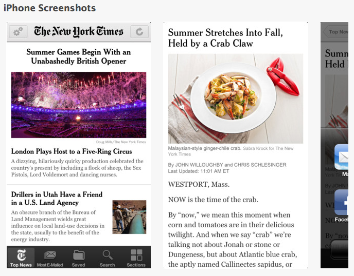
A year ago I was all about the NYTimes news app. So much so that I had a subscription, just to the NYTimes, and just so I could read as much as I wanted without getting their paywall cutoff. But then, I found that I got sick of how long it took for the app to load, how often it froze and crashed and how clunky the mobile app started to feel overall.
I was having what UX consultants would call "a bad user experience." Point being, I started to avoid opening the app because of how little I enjoyed actually reading the news there. I would fantasize about how great faster load times would be, or how nice it would be if you could actually see the pictures when you scrolled through the new articles. Yeah, I got a little geeky.
But is that really that strange? I wanted the app to work smoothly, I wanted pictures I could see, and I wanted the app not to crash. Is that me being a picky mobile reader? Maybe. But if I'm getting picky after six months, I'm sure a lot of other people are as well. I stopped paying for my subscription. Then I stopped reading altogether.
The Atlantic keeps it simple
I moved over to the Atlantic. The writing is good, maybe not on par with the Opinion pieces at the NYTimes, but to tell you the truth, I enjoy reading the Atlantic app more simply because the app is smooth and simple to use, it rarely freezes or crashes, and it loads much quicker. As a purely word-loving guy, this rocked my own self-concept of what I like and why I like it.
It worked. And when you open the app, it's a horizontal swipe series of eight pictures, each with a title underneath. You swipe through and choose the article you want to read. Tap it and you're there. I love it. Simple.
The Magazine makes it beautiful
Then came The Magazine.
Whoa, Nellie. This is a good looking and smooth functioning app. And I think a big part about what makes this app so good is the simplicity with which they approach the publishing process. @CraigMod has a great post about what he calls "Sub-compact Publishing" in which he compares the way The Magazine is approaching publishing to the way Honda approached making cars in the late 1960s. I recommend the full read, but the gist is that while the rest of the country was making big cars, Honda took only the essential elements of a car and made a beautiful, simple, streamlined version of it.
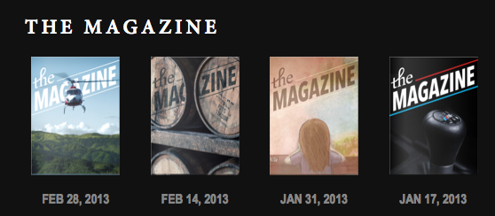
The Magazine is doing the same thing for digital publishing. They publish five articles every two weeks, charge $1.99 a month, and deliver the best reading experience I've had on a smartphone. It's The Atlantic but better. And it lives in the Apple iOS Newstand container.
The Magazine ditches the pictures on the home screen and just lists the titles, but does it vertically so that you can swipe through them like e-mail. Inside the article itself, the loading has always been smooth, and they even have a clever innovation to using footnotes that I think is the sleeper hit of the app overall.
What the Magazine does on a publishing level is show that it is possible to create a simple, elegant publishing vehicle through iOS that people will want to read and be willing to pay for. I signed on for the subscription, and so far I've been happy about it. The writing is good and the app works better than the New York Times ever did. There are already a lot of other people starting to use Newsstand and other iOS approaches to make better, smoother, more user-friendly reading experiences on smartphones, and if you're interested, you can read about some of the evolutions and controversy here.
Just enjoy
But if you're an avid reader like me, it's enough to just sit back and smile and realize that there are people out there working hard on making smartphone reading smoother and more enjoyable. So sit back and enjoy it!
Images courtesy of screenshot from The Magazine and screenshot from The New York Times
